Blind Deboss and 1-color Letterpress with Custom Illustrations
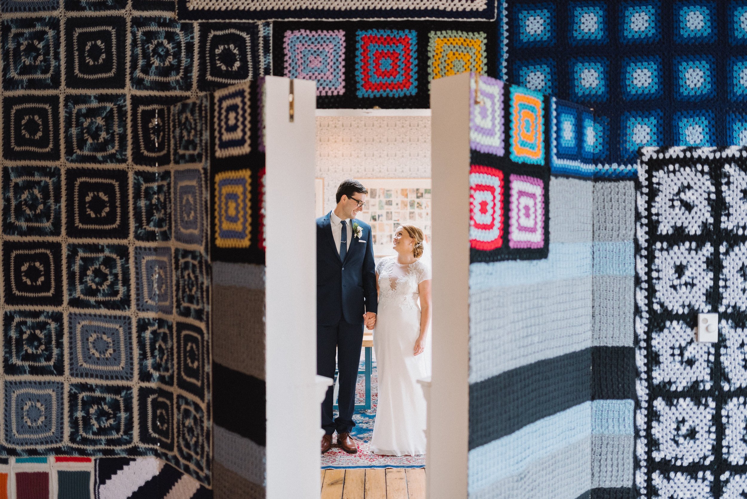
Catherine and Quinn came to us looking for a simple wedding suite that showcased our signature illustrations and details from their wedding venue, The Bachelor Farmer MPLS. We used a wallpaper pattern as our starting point to build a color palette and illustrations for the wedding suite.
The wedding invitation used 1-color letterpress with subtle blind de-boss illustrations. Those same illustrations were used again on the details card and to mark the ceremony and reception location on our custom map. We re-created a wallpaper pattern with watercolor for the envelope liner and pulled colors from the watercolor for the details card paper and reply card envelope. The final result was a sweet but subtle wedding suite that had us star-y eyed.
With a smaller ceremony and venue, we created a program sign in lieu of individual programs. We used some of the same illustrated details and matched fonts back to the hand script of the invitations for a cohesive look.
Thanks so much to Johnny + Liz Photography for sharing photos with us! You can find more of their work here and here!


