White Space
Mackenzie and Christopher stole my heart with their appreciation for white space.
White space is the design element that marries elegance with functionality. Most things we encounter daily do not take white space into consideration. There is so much noise. White space provides the calm, the quiet confidence to provide breathing room between elements.
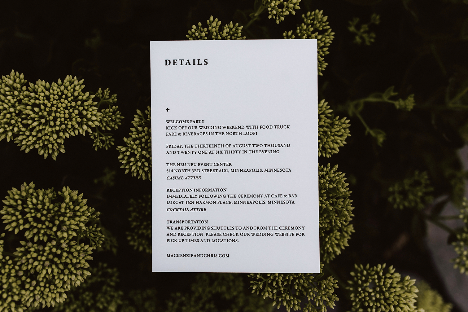
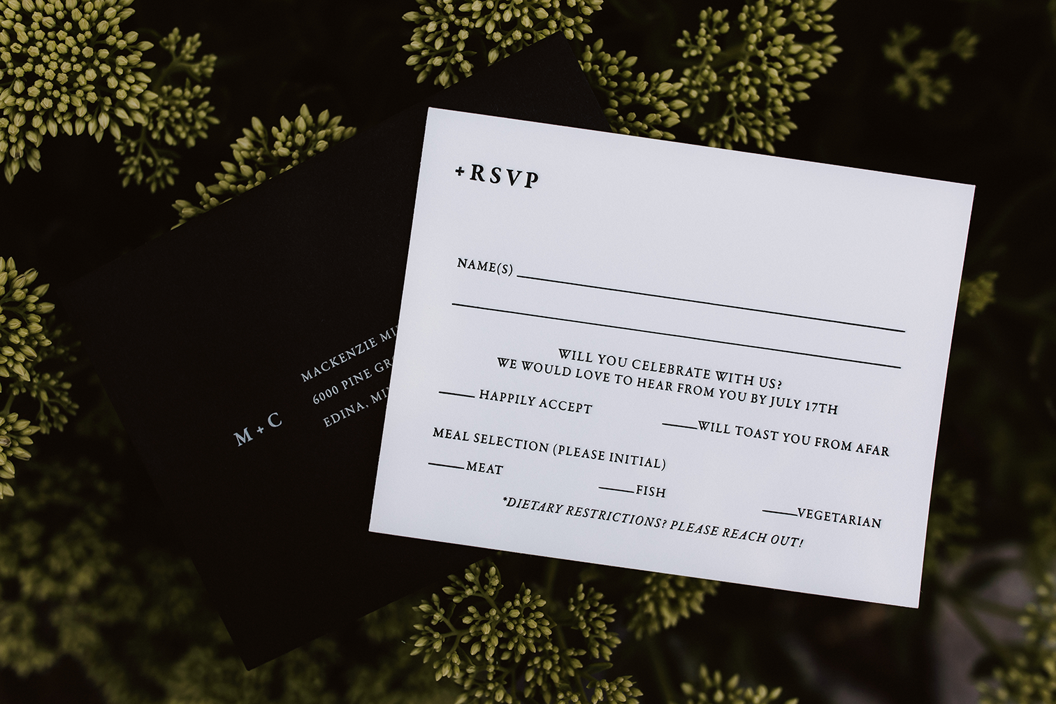
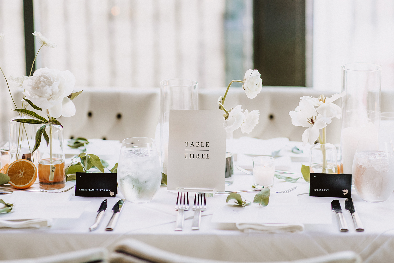
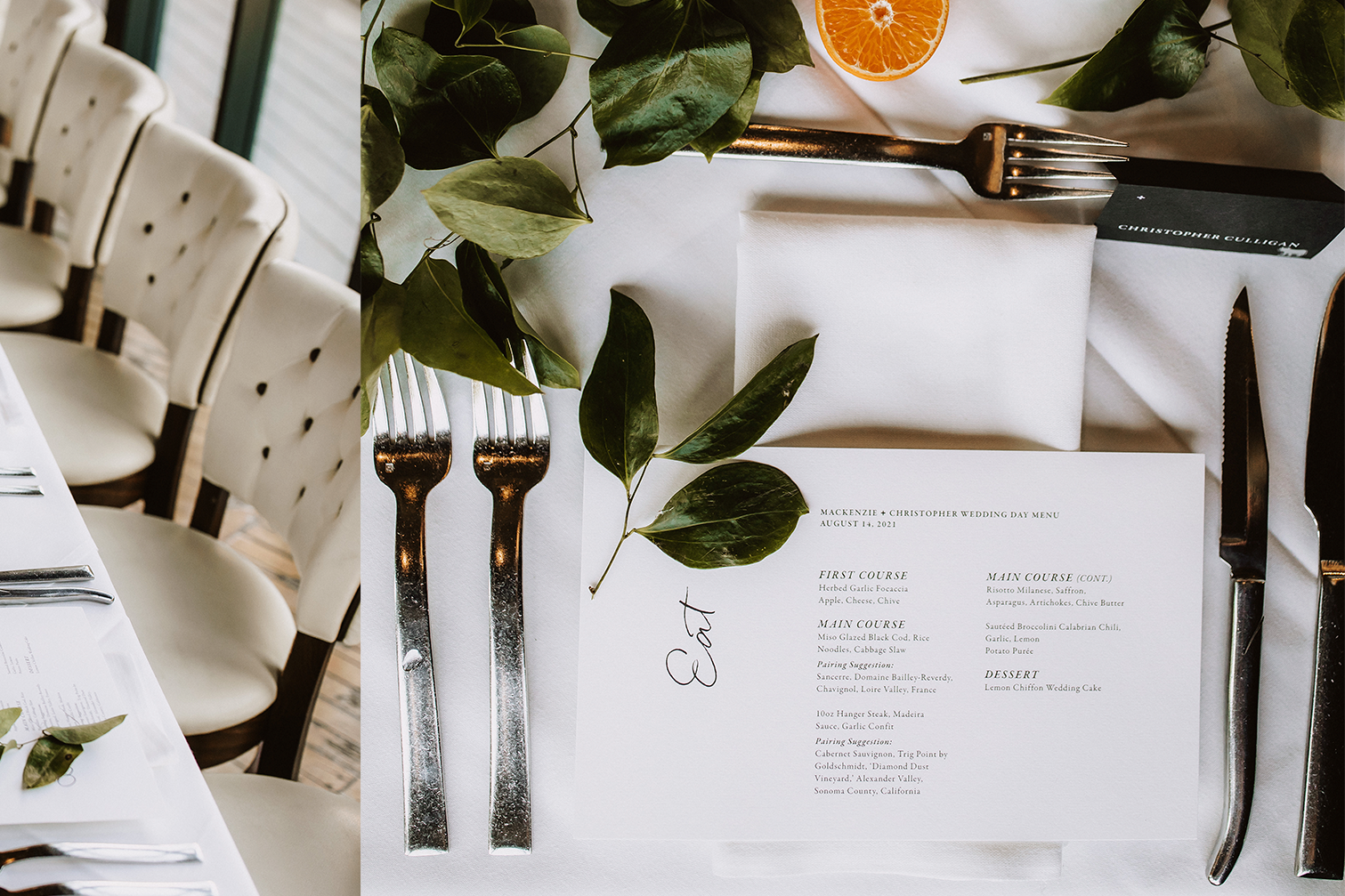
It takes a lot of confidence to embrace white space. When you do, it elevates the entire experience, as you can see with the designs for Mackenzie and Christopher’s wedding.
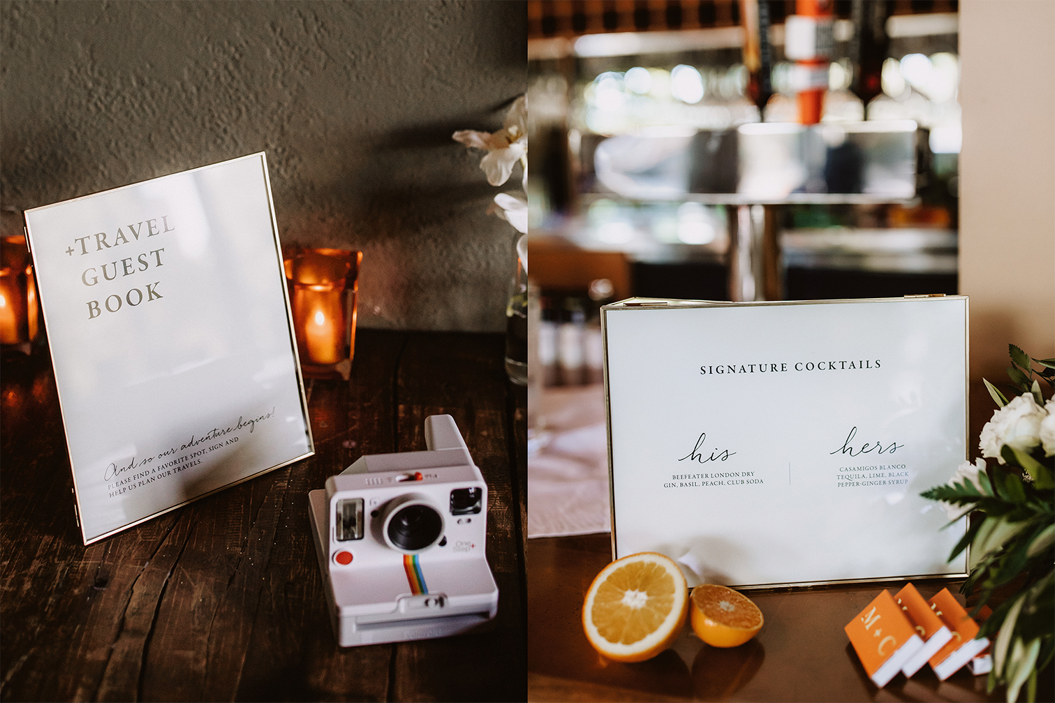
The design direction was to express a modern classic feel. For classic, we designed the type in a serif font, which also screams elegance and used their established black and white color palette. To keep it modern, we created a simple logo comprised of their initials and the “plus” sign and used that “branding” throughout the stationery pieces. The simple logo in addition to the white space, expressed the modernity they were looking for.
As we designed their day of elements, we continued using white space, logo, and added a script typeface to make signage and directions feel more conversational.
To learn more about our design process. Contact us and tell us about your upcoming event.
Very special thanks to Matt Lien Photography for use of his beautiful photos on this site.


